引言 大家好啊,我是前端拿破轮。
最近在学习React Native(简称为RN),所以打算记录一下,希望能够对各位读者有所帮助。
什么是React Native 简单来说,React Native是一个跨平台的移动端开发框架,能够让咱们开发人员使用JavaScript和React构建原生IOS和Android应用程序。
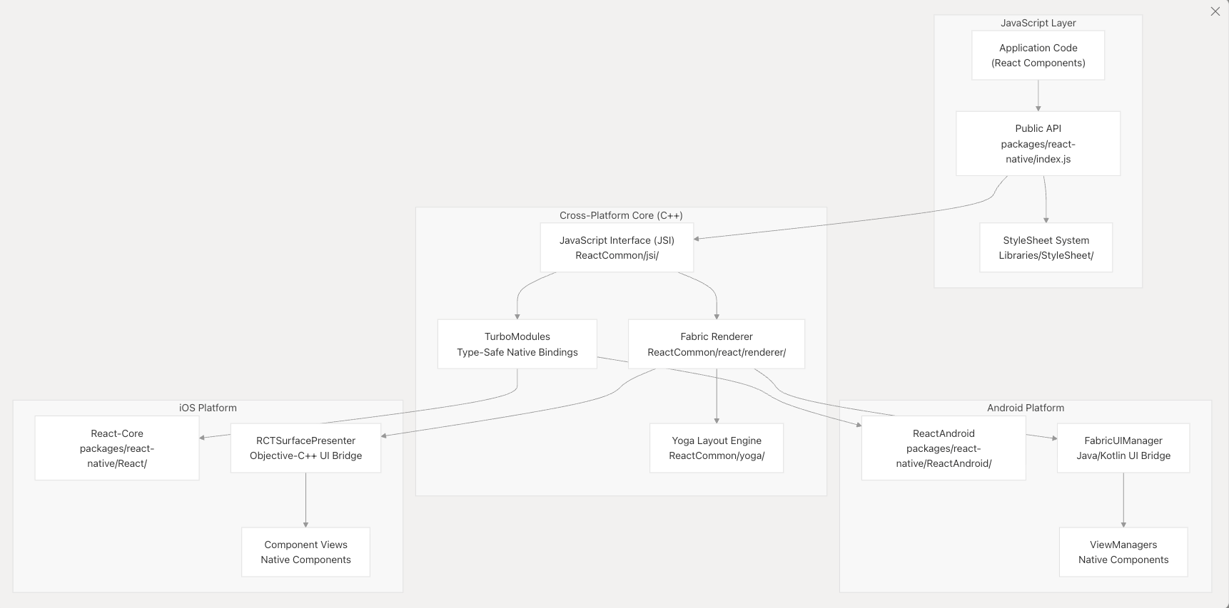
在设计理念上,React Native遵循分层架构,将JavaScript应用程序代码,跨平台的C++渲染基础设施和基于特定平台的本地实现之间的关注点分开。真正实现在React中编写一次,就可以在iOS和Android上生成真正的原生用户界面。
如何使用React Native 这里我们直接从一个demo程序开始,在做的过程中再解释。
配置环境 这里大家可以直接去expo文档官网 来查看如何配置环境。
不同的开发设备,配置的方式也有所差异,官方文档都提供了详细的配置教程。
我这里以macOS,使用iOS的模拟器为例,进行开发。
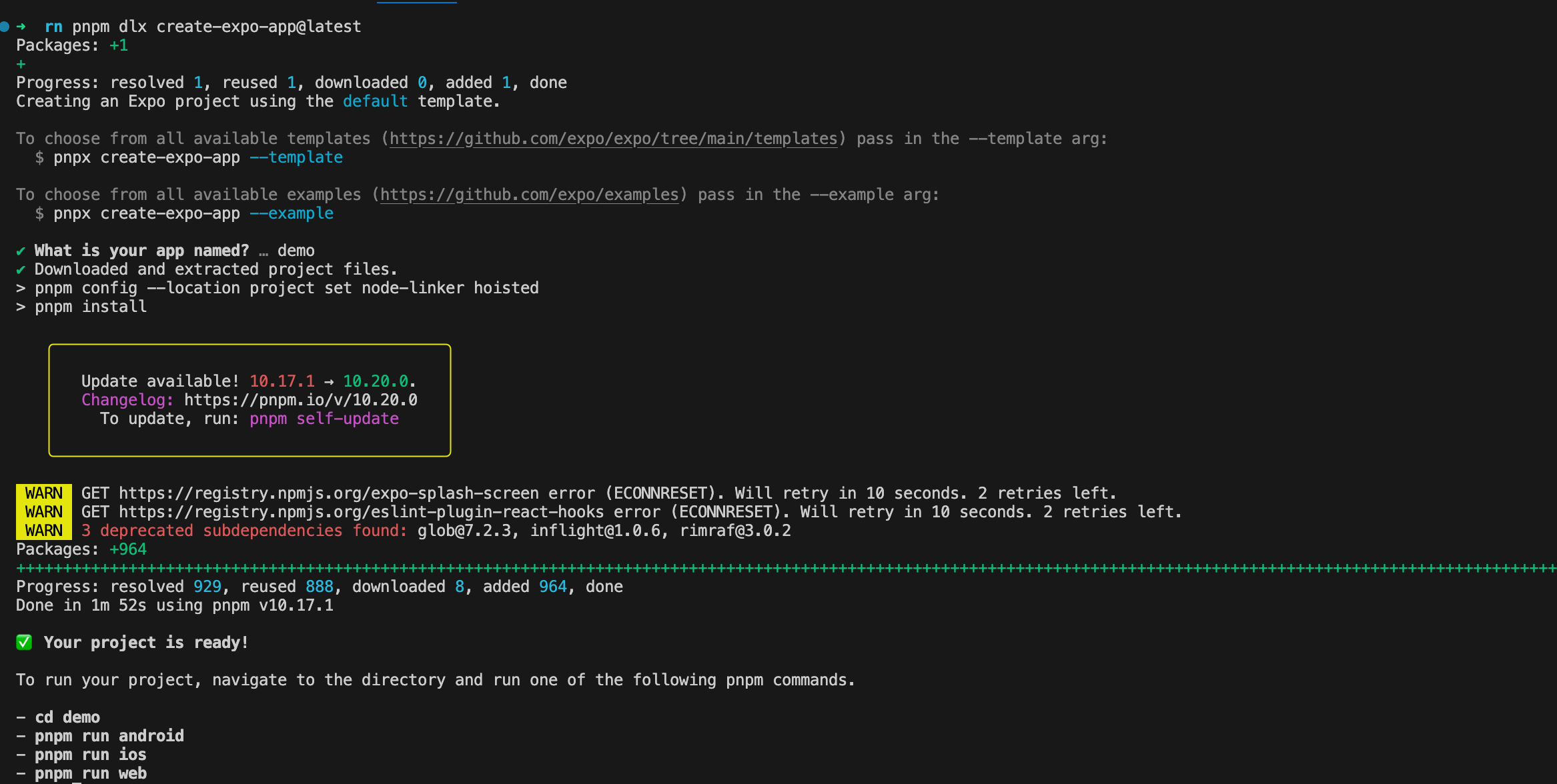
创建应用 1 2 # 利用expo框架快速创建一个RN应用 pnpm dlx create-expo-app@latest
expo是一个开发RN应用的框架,集成了一系列的工具和服务,可以让我们快速的开发RN应用。
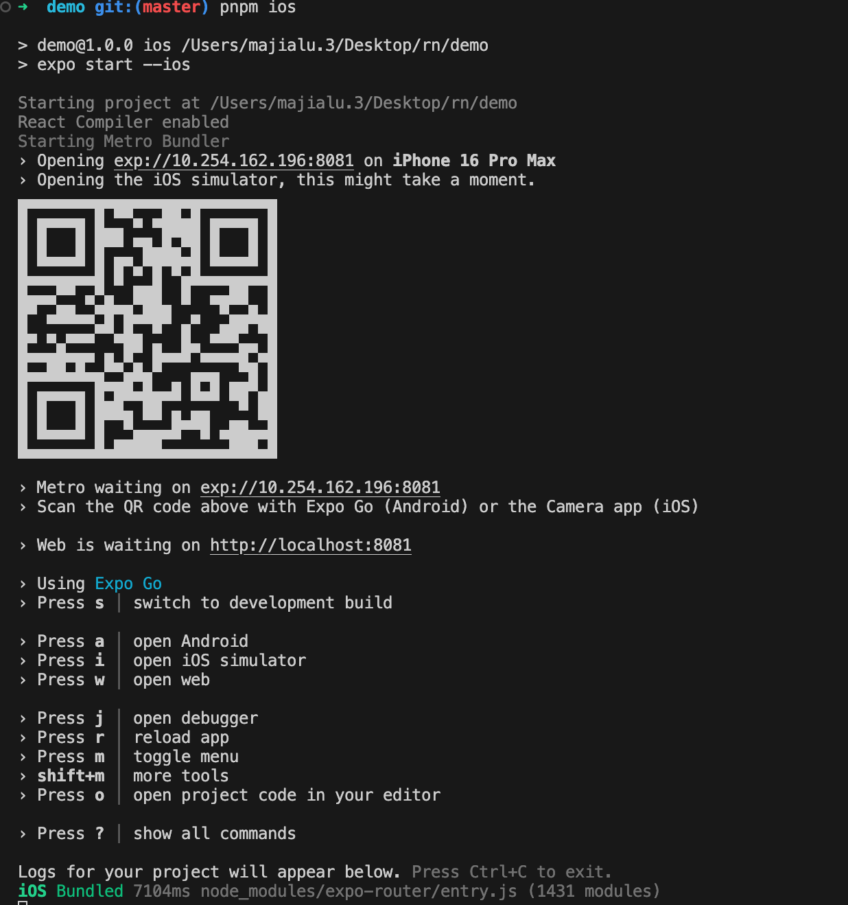
根据命令行提示进入该目录并启动应用。
1 2 3 4 5 # 进入demo目录 cd demo # 启动应用 pnpm ios
这里如果在手机上下载了expo客户端,可以直接在手机上扫描二维码,打开应用(注意手机和电脑在同一个局域网下)。
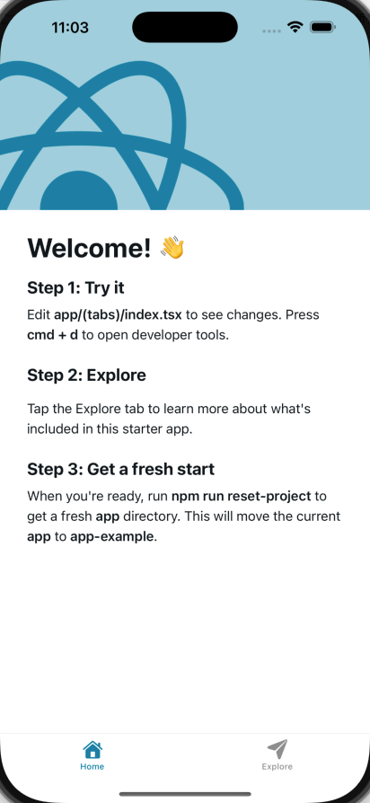
我们这里的话使用模拟器打开应用。
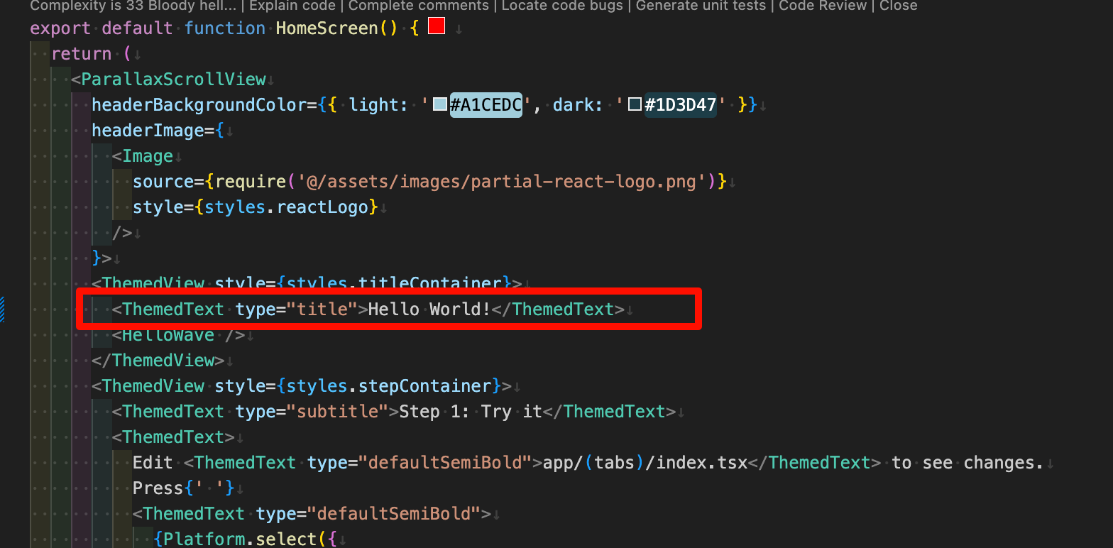
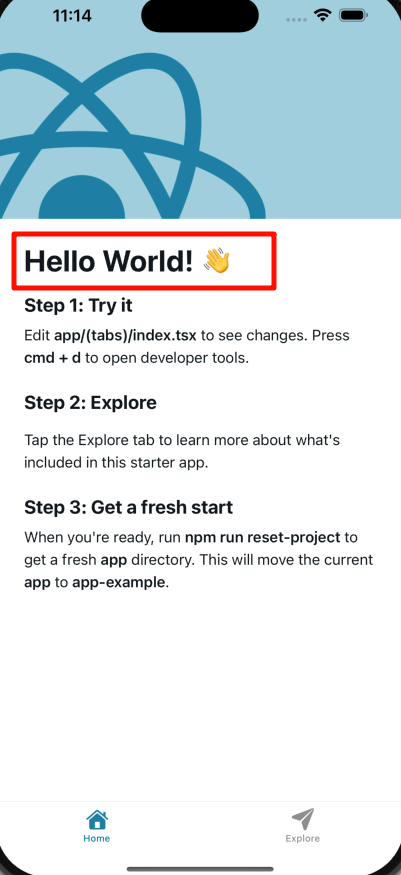
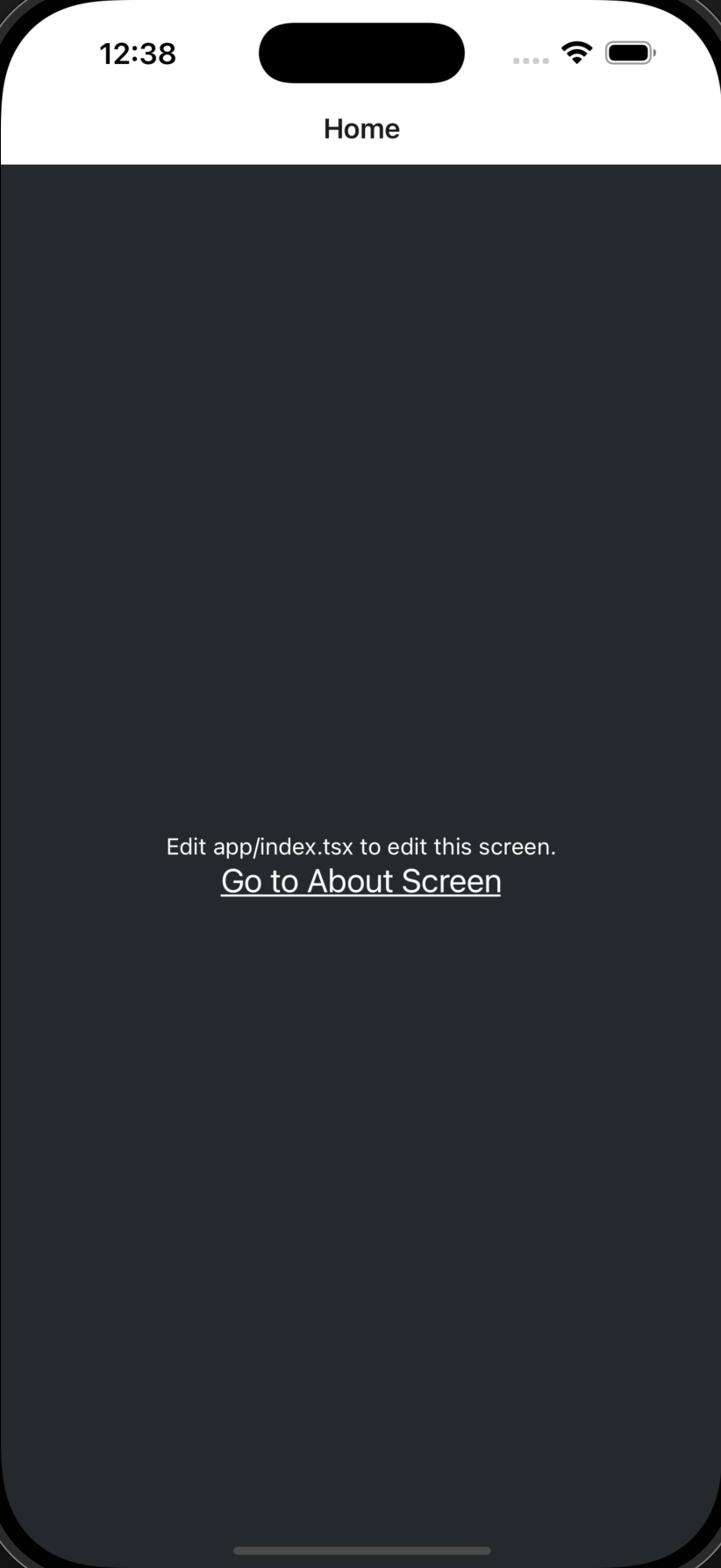
热更新 打开app/(tabs)/index.tsx文件,可以看到首页的代码。我们尝试修改Welcome!为Hello World!。
然后我们可以看到应用自己触发了热更新,不用我们手动刷新。
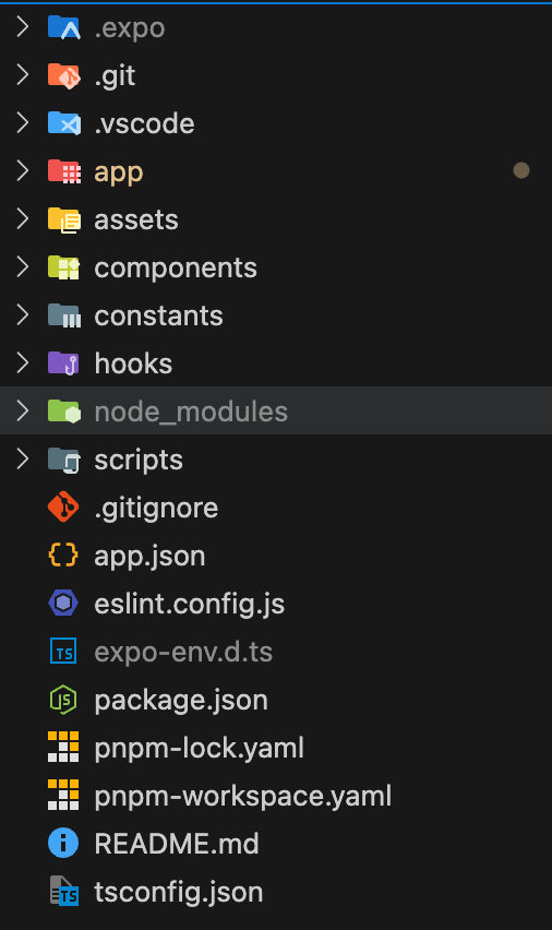
目录介绍 我们来观察一下expo脚手架的目录结构。
.expo:这是我们在使用pnpm ios的时候自动生成的一个目录,里面存放了一些expo的配置文件。app:这是我们的应用程序代码,包括UI和业务逻辑,类似于我们在Web开发中常用的src目录。assets:存放应用程序的静态资源,比如图片、字体等。components:存放组件的文件夹,不解释。constants:常量,不解释。hooks:存放react的hooks。scripts:存放我们自定义的脚本文件,项目创建时自带一个reset-project的脚本,可以将初始的项目代码重置为空白。app.json:这是RN应用的配置文件,配置在不同平台上应用的基础信息。其他:常见的项目配置文件,不解释。
重置项目 我们可以运行以下命令来重置demo代码,开始一个新项目。
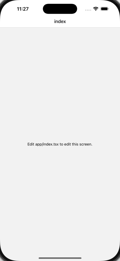
开发demo 基本概念 这个脚本将app目录中的所有文件移动到app-example,然后创建一个带有index.tsx的新index.tsx文件的新app目录。
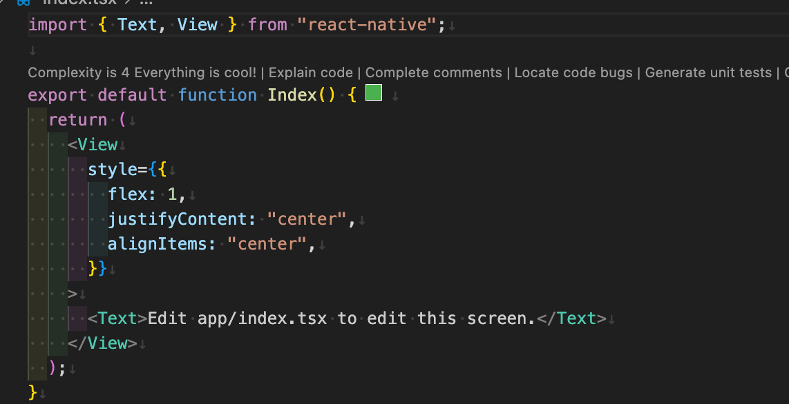
我们可以看到在app/index.tsx文件中,,有一个简单的React函数式组件。
这里使用了两个从react-native导入的组件,Text和View。
Text组件用于显示文本,View组件用于显示容器。
和在Web开发中不同,RN中的文字不能直接写,必须包裹在Text组件中。
View组件就类似于div,用于显示容器。
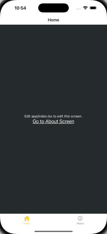
1 2 3 4 5 6 7 8 9 10 11 12 13 14 15 import { Text , View } from 'react-native' ;export default function Index ( return ( <View style ={{ flex: 1 , justifyContent: 'center ', alignItems: 'center ', }} > <Text > Edit app/index.tsx to edit this screen.</Text > </View > ); }
关于样式,我们可以看到style属性是一个对象,里面包含了flex、justifyContent和alignItems等属性。这些和Web开发中的CSS属性类似,用于设置容器的布局和对齐方式。
注意:RN中没有CSS文件,所有的样式都写在JavaScript中。
如果我们想要书写样式,要使用StyleSheet来创建一个styles。
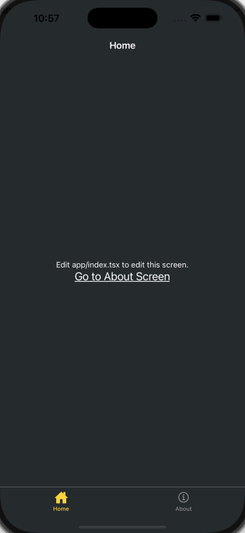
1 2 3 4 5 6 7 8 9 10 11 12 13 14 15 16 17 18 19 20 21 import { StyleSheet , Text , View } from 'react-native' ;export default function Index ( return ( <View style ={styles.container} > <Text style ={styles.text} > Edit app/index.tsx to edit this screen.</Text > </View > ); } const styles = StyleSheet .create ({ container : { flex : 1 , backgroundColor : '#25292e' , alignItems : 'center' , justifyContent : 'center' , }, text : { color : '#fff' , }, });
添加导航 我们这里使用Expo Router,这是一个基于文件 的路由框架,适用于React Native和Web应用。使用的时候,我们需要了解以下约定:
app目录:这是一个特殊的目录,仅包含路由及其布局。添加到这个目录中的任何文件都会成为我们原生应用中的一个屏幕。app/_layout.tsx文件:这是固定命名文件,不能修改 ,定义了共享的UI元素,比如标题栏和标签栏 ,以便它们在不同路由之间保持一致。路由文件默认导出React组件,可以用.js,.jsx,.ts,.tsx来命名。
在app目录中新建一个about.tsx的新文件,当用户访问/about路径时,会显示这个页面。
1 2 3 4 5 6 7 8 9 10 11 12 13 14 15 16 17 18 19 20 21 22 import { StyleSheet , Text , View } from 'react-native' ;import React from 'react' ;export default function about ( return ( <View style ={styles.container} > <Text style ={styles.text} > about</Text > </View > ); } const styles = StyleSheet .create ({ container : { flex : 1 , backgroundColor : '#25292e' , alignItems : 'center' , justifyContent : 'center' , }, text : { color : '#fff' , }, });
在_layout.tsx中,我们进行相关配置。
1 2 3 4 5 6 7 8 9 10 import { Stack } from 'expo-router' ;export default function RootLayout ( return ( <Stack > <Stack.Screen name ="index" options ={{ title: 'Home ' }} /> <Stack.Screen name ="about" options ={{ title: 'About ' }} /> </Stack > ); }
这里的Stack是Expo Router的组件,用于定义路由的堆栈。
切换屏幕 在app/index.tsx中,我们添加一个按钮,当用户点击按钮时,会跳转到/about路径。
1 2 3 4 5 6 7 8 9 10 11 12 13 14 15 16 17 18 19 20 21 22 23 24 25 26 27 28 29 30 import { Link } from 'expo-router' ;import { StyleSheet , Text , View } from 'react-native' ;export default function Index ( return ( <View style ={styles.container} > <Text style ={styles.text} > Edit app/index.tsx to edit this screen.</Text > <Link href ="/about" style ={styles.button} > Go to About Screen </Link > </View > ); } const styles = StyleSheet .create ({ container : { flex : 1 , backgroundColor : '#25292e' , alignItems : 'center' , justifyContent : 'center' , }, text : { color : '#fff' , }, button : { fontSize : 20 , textDecorationLine : 'underline' , color : '#fff' , }, });
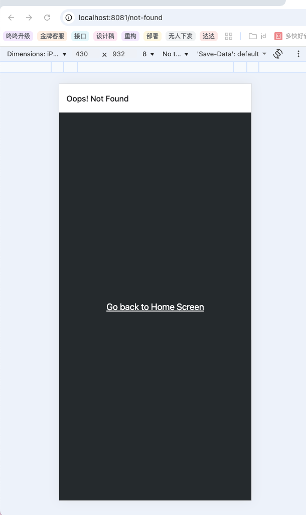
错误路由页面 当路由不存在时,我们可以用+not-found路由来显示备用页面。这样可以避免应用崩溃或者显示对用户不友好的404错误。在Expo Router中,我们可以使用一个特殊的文件+not-found.tsx来实现。
注意,这里的文件名+not-found.tsx是固定名称,不能随意修改。
在app目录中新建一个+not-found.tsx的新文件,用来添加NotFoundScreen组件。
给Stack.Screen添加options属性,为这个路由自定义屏幕标题。
添加一个Link组件,用于导航到首页。
这里我们在原生应用不是很好测试错误路由页面,所以我们可以在浏览器中访问一个不存在的路由,比如http://localhost:8081/not-found,可以看到Expo Router会自动跳转到+not-found.tsx页面。
1 2 3 4 5 6 7 8 9 10 11 12 13 14 15 16 17 18 19 20 21 22 23 24 25 26 27 28 29 import { StyleSheet , Text , View } from 'react-native' ;import React from 'react' ;import { Stack } from 'expo-router' ;export default function NotFoundScreen ( return ( <> <Stack.Screen options ={{ title: 'Oops ! Not Found ' }} /> <View style ={styles.container} > <Text style ={styles.button} > Go back to Home Screen</Text > </View > </> ); } const styles = StyleSheet .create ({ container : { flex : 1 , backgroundColor : '#25292e' , justifyContent : 'center' , alignItems : 'center' , }, button : { fontSize : 20 , textDecorationLine : 'underline' , color : '#fff' , }, });
添加导航栏
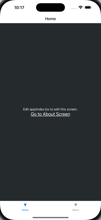
在app目录下,添加一个(tabs)的子目录,这个目录用于将路由分组并显示在底部的标签栏中。
创建(tabs)/_layout.tsx文件,该文件将用于自定义选项卡布局,该布局和根布局是独立的。
将现有的index.tsx和about.tsx移动到(tabs)目录下,应用程序的目录结构如下所示:
1 2 3 4 5 6 7 📦app ┣ 📂(tabs) ┃ ┣ 📜_layout.tsx ┃ ┣ 📜about.tsx ┃ ┗ 📜index.tsx ┣ 📜+not-found.tsx ┗ 📜_layout.tsx
更新根布局文件,添加(tabs)路由:
1 2 3 4 5 6 7 8 9 import { Stack } from 'expo-router' ;export default function RootLayout ( return ( <Stack > <Stack.Screen name ="(tabs)" options ={{ headerShown: false }} /> </Stack > ); }
在(tabs)/_layout.tsx中,添加一个Tabs组件来定义底部标签布局。
1 2 3 4 5 6 7 8 9 10 import { Tabs } from 'expo-router' ;export default function TabLayout ( return ( <Tabs > <Tabs.Screen name ="index" options ={{ title: 'Home ' }} /> <Tabs.Screen name ="about" options ={{ title: 'About ' }} /> </Tabs > ); }
我们可以看到应用已经添加了底部导航栏。但是图标样式是默认的三角形,我们可以自定义修改。
修改导航栏样式 修改(tabs)/_layout.tsx文件来添加标签栏图标。
从@expo/vector-icons中导入Ionicons图标库。
将tabBarIcon添加到index和about路由,这是一个函数,接受focused和color作为参数,并渲染图标组件。
在Tabs组件中添加screenOptions.tabBarActiveTintColor属性,并将其设置为#ffd33d,这用来设置激活时的标签颜色。
我们还可以利用screenOptions属性来更改标签栏和标题栏的背景颜色
1 2 3 4 5 6 7 8 9 10 11 12 13 14 <Tabs screenOptions={{ tabBarActiveTintColor : '#ffd33d' , headerStyle : { backgroundColor : '#25292e' , }, headerShadowVisible : false , headerTintColor : '#fff' , tabBarStyle : { backgroundColor : '#25292e' , }, }} >
这下导航栏和整个页面的风格也更加的一致。
编辑首页
最后,我们要实现一个类似上面的效果。
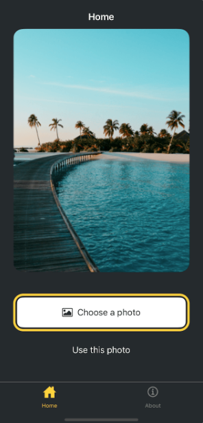
我们观察发现,页面主要由三个部分组成,分别是
占据屏幕大部分的图片
选择图片按钮
使用默认图片按钮
显示图片 我们使用expo-image来展示图片:
1 pnpm dlx expo install expo-image
访问Expo官网 来下载静态资源,并替换app/assets/images。
1 2 3 4 5 6 7 8 9 10 11 12 13 14 15 16 17 18 19 20 21 22 23 24 25 26 27 28 29 30 31 32 33 import { Image } from 'expo-image' ;import { StyleSheet , View } from 'react-native' ;const PlaceholderImage = require ('@/assets/images/background-image.png' );export default function Index ( return ( <View style ={styles.container} > <View style ={styles.imageContainer} > <Image style ={styles.image} source ={PlaceholderImage} /> </View > </View > ); } const styles = StyleSheet .create ({ container : { flex : 1 , backgroundColor : '#25292e' , alignItems : 'center' , }, imageContainer : { flex : 1 , }, image : { width : 320 , height : 440 , borderRadius : 18 , }, });
拆分组件 在RN开发中,同样遵循组件化的原则。
在项目根目录创建components目录,并在其中创建ImageViewer.tsx文件。
将用于显示图像的代码以及image样式移到此文件中。
1 2 3 4 5 6 7 8 9 10 11 12 13 14 15 16 17 18 19 20 21 22 23 24 25 26 27 28 29 30 31 32 import { Image } from 'expo-image' ;import { StyleSheet , View } from 'react-native' ;const PlaceholderImage = require ('@/assets/images/background-image.png' );export default function Index ( return ( <View style ={styles.container} > <View style ={styles.imageContainer} > <Image style ={styles.image} source ={PlaceholderImage} /> </View > </View > ); } const styles = StyleSheet .create ({ container : { flex : 1 , backgroundColor : '#25292e' , alignItems : 'center' , }, imageContainer : { flex : 1 , }, image : { width : 320 , height : 440 , borderRadius : 18 , }, });
在app/(tabs)/index.tsx中使用它:
1 2 3 4 5 6 7 8 9 10 11 12 13 14 15 16 17 18 19 20 21 22 23 24 25 26 import ImageViewer from '@/components/ImageViewer' ;import { StyleSheet , View } from 'react-native' ;const PlaceholderImage = require ('@/assets/images/background-image.png' );export default function Index ( return ( <View style ={styles.container} > <View style ={styles.imageContainer} > <ImageViewer imgSource ={PlaceholderImage} /> </View > </View > ); } const styles = StyleSheet .create ({ container : { flex : 1 , backgroundColor : '#25292e' , alignItems : 'center' , }, imageContainer : { flex : 1 , }, });
添加按钮 在我们的设计中,需要两个按钮,但是每个按钮的样式和标签都不同。首先,我们需要为这些按钮创建一个可重用的组件。
在components目录下创建一个名为Button的文件,并添加以下代码:
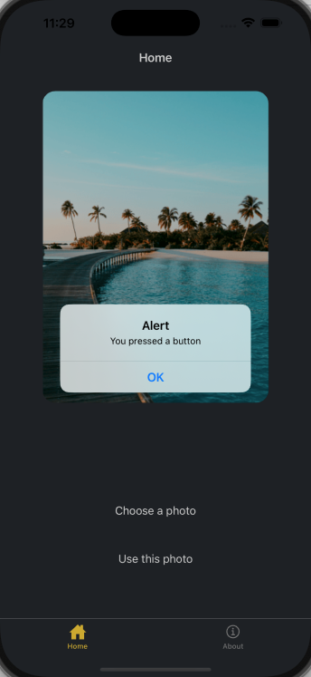
1 2 3 4 5 6 7 8 9 10 11 12 13 14 15 16 17 18 19 20 21 22 23 24 25 26 27 28 29 30 31 32 33 34 35 36 37 38 39 40 41 42 43 import { Pressable , StyleSheet , Text , View } from 'react-native' ;type Props = { label : string ; }; export default function Button ({ label }: Props ) { return ( <View style ={styles.buttonContainer} > <Pressable style ={styles.button} onPress ={() => alert('You pressed a button')} > <Text style ={styles.buttonLabel} > {label}</Text > </Pressable > </View > ); } const styles = StyleSheet .create ({ buttonContainer : { width : 320 , height : 68 , marginHorizontal : 20 , alignItems : 'center' , justifyContent : 'center' , padding : 3 , }, button : { borderRadius : 10 , width : '100%' , height : '100%' , alignItems : 'center' , justifyContent : 'center' , flexDirection : 'row' , }, buttonLabel : { color : '#fff' , fontSize : 16 , }, });
应为两个按钮的样式不同,所以需要我们对Button.tsx组件进行调整。
1 2 3 4 5 6 7 8 9 10 11 12 13 14 15 16 17 18 19 20 21 22 23 24 25 26 27 28 29 30 31 32 33 34 35 36 37 38 39 40 41 42 43 44 45 46 47 48 49 50 51 52 53 54 55 56 57 58 59 60 61 62 63 64 65 66 67 68 69 70 71 72 73 74 import { Pressable , StyleSheet , Text , View } from 'react-native' ;import FontAwesome from '@expo/vector-icons/FontAwesome' ;type Props = { label : string ; theme ?: 'primary' ; }; export default function Button ({ label, theme }: Props ) { if (theme === 'primary' ) { return ( <View style ={[ styles.buttonContainer , { borderWidth: 4 , borderColor: '#ffd33d ', borderRadius: 18 }, ]} > <Pressable style ={[styles.button, { backgroundColor: '#fff ' }]} onPress ={() => alert('You press a button.')} > <FontAwesome name ="picture-o" size ={18} color ="#25292e" style ={styles.buttonIcon} /> <Text style ={[styles.buttonLabel, { color: '#25292d ' }]}> {label} </Text > </Pressable > </View > ); } return ( <View style ={styles.buttonContainer} > <Pressable style ={styles.button} onPress ={() => alert('You pressed a button')} > <Text style ={styles.buttonLabel} > {label}</Text > </Pressable > </View > ); } const styles = StyleSheet .create ({ buttonContainer : { width : 320 , height : 68 , marginHorizontal : 20 , alignItems : 'center' , justifyContent : 'center' , padding : 3 , }, button : { borderRadius : 10 , width : '100%' , height : '100%' , alignItems : 'center' , justifyContent : 'center' , flexDirection : 'row' , }, buttonIcon : { paddingRight : 8 , }, buttonLabel : { color : '#fff' , fontSize : 16 , }, });
修改app/(tabs)/index.tsx文件,在第一个按钮上使用theme="primary"属性
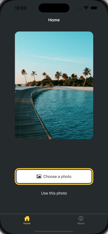
1 2 3 4 5 6 7 8 9 10 11 12 13 14 15 16 17 18 19 20 21 22 23 24 25 26 27 28 29 30 31 32 33 34 35 import { View , StyleSheet } from 'react-native' ;import Button from '@/components/Button' ;import ImageViewer from '@/components/ImageViewer' ;const PlaceholderImage = require ('@/assets/images/background-image.png' );export default function Index ( return ( <View style ={styles.container} > <View style ={styles.imageContainer} > <ImageViewer imgSource ={PlaceholderImage} /> </View > <View style ={styles.footerContainer} > <Button theme ="primary" label ="Choose a photo" /> <Button label ="Use this photo" /> </View > </View > ); } const styles = StyleSheet .create ({ container : { flex : 1 , backgroundColor : '#25292e' , alignItems : 'center' , }, imageContainer : { flex : 1 , }, footerContainer : { flex : 1 / 3 , alignItems : 'center' , }, });
添加图片选择器 安装expo-image-picker
1 pnpm dlx expo install expo-image-picker
更新app/(tabs)/index.tsx文件
1 2 3 4 5 6 7 8 9 10 11 12 13 14 15 16 17 18 19 20 import * as ImagePicker from 'expo-image-picker' ;export default function Index ( const pickImageAsync = async ( let result = await ImagePicker .launchImageLibraryAsync ({ mediaTypes : ['images' ], allowsEditing : true , quality : 1 , }); if (!result.canceled ) { console .log (result); } else { alert ('You did not select any image.' ); } }; }
更新按钮组件 1 2 3 4 5 6 7 8 9 10 11 12 13 14 15 16 17 18 19 20 21 22 23 24 25 26 27 28 29 30 31 32 33 34 35 36 37 38 39 40 41 42 43 44 45 46 47 48 49 50 51 52 53 54 55 56 57 58 59 60 61 62 63 64 65 66 67 68 69 70 71 72 73 import { StyleSheet , View , Pressable , Text } from 'react-native' ;import FontAwesome from '@expo/vector-icons/FontAwesome' ;type Props = { label : string ; theme ?: 'primary' ; onPress ?: () => void ; }; export default function Button ({ label, theme, onPress }: Props ) { if (theme === 'primary' ) { return ( <View style ={[ styles.buttonContainer , { borderWidth: 4 , borderColor: '#ffd33d ', borderRadius: 18 }, ]} > <Pressable style ={[styles.button, { backgroundColor: '#fff ' }]} onPress ={onPress} > <FontAwesome name ="picture-o" size ={18} color ="#25292e" style ={styles.buttonIcon} /> <Text style ={[styles.buttonLabel, { color: '#25292e ' }]}> {label} </Text > </Pressable > </View > ); } return ( <View style ={styles.buttonContainer} > <Pressable style ={styles.button} onPress ={() => alert('You pressed a button.')} > <Text style ={styles.buttonLabel} > {label}</Text > </Pressable > </View > ); } const styles = StyleSheet .create ({ buttonContainer : { width : 320 , height : 68 , marginHorizontal : 20 , alignItems : 'center' , justifyContent : 'center' , padding : 3 , }, button : { borderRadius : 10 , width : '100%' , height : '100%' , alignItems : 'center' , justifyContent : 'center' , flexDirection : 'row' , }, buttonIcon : { paddingRight : 8 , }, buttonLabel : { color : '#fff' , fontSize : 16 , }, });
在app/(tabs)/index.tsx文件中,将pickImageAsync函数添加到第一个<Button>的onPress属性中。
1 2 3 4 5 6 7 8 9 10 11 12 13 14 15 16 17 18 19 20 21 22 23 24 25 26 27 28 29 30 31 32 33 34 35 36 37 38 39 40 41 42 43 44 45 46 47 48 49 50 51 52 53 54 import { View , StyleSheet } from 'react-native' ;import * as ImagePicker from 'expo-image-picker' ;import Button from '@/components/Button' ;import ImageViewer from '@/components/ImageViewer' ;const PlaceholderImage = require ('@/assets/images/background-image.png' );export default function Index ( const pickImageAsync = async ( let result = await ImagePicker .launchImageLibraryAsync ({ mediaTypes : ['images' ], allowsEditing : true , quality : 1 , }); if (!result.canceled ) { console .log (result); } else { alert ('You did not select any image.' ); } }; return ( <View style ={styles.container} > <View style ={styles.imageContainer} > <ImageViewer imgSource ={PlaceholderImage} /> </View > <View style ={styles.footerContainer} > <Button theme ="primary" label ="Choose a photo" onPress ={pickImageAsync} /> <Button label ="Use this photo" /> </View > </View > ); } const styles = StyleSheet .create ({ container : { flex : 1 , backgroundColor : '#25292e' , alignItems : 'center' , }, imageContainer : { flex : 1 , }, footerContainer : { flex : 1 / 3 , alignItems : 'center' , }, });
我们可以选择一个图片进行测试,在iOS的模拟器上,result类似下面这样:
1 2 3 4 5 6 7 8 9 10 11 12 13 14 15 16 17 18 { "assets" : [ { "assetId" : "99D53A1F-FEEF-40E1-8BB3-7DD55A43C8B7/L0/001" , "base64" : null , "duration" : null , "exif" : null , "fileName" : "IMG_0004.JPG" , "fileSize" : 2548364 , "height" : 1669 , "mimeType" : "image/jpeg" , "type" : "image" , "uri" : "file:///data/user/0/host.exp.exponent/cache/ExperienceData/%2540anonymous%252FStickerSmash-13f21121-fc9d-4ec6-bf89-bf7d6165eb69/ImagePicker/ea574eaa-f332-44a7-85b7-99704c22b402.jpeg" , "width" : 1668 } ] , "canceled" : false }
展示选择的图像 result对象提供了一个assets数组,其中包含所选图片的uri。
我们可以修改app/(tabs)/index.tsx文件来展示选择的图像。
使用React的useState钩子来声明一个名为selectedImage的状态变量,用来保存此状态变量所保存图片的URI。
更新pickImageAsync()函数,将图像的URI保存到selectedImage状态变量中。
将selectedImage状态变量传递给ImageViewer组件。
更新ImageViewer组件,新增selectedImage属性,用于接收selectedImage状态变量。
1 2 3 4 5 6 7 8 9 10 11 12 13 14 15 16 17 18 19 20 21 22 23 24 25 26 27 28 29 30 31 32 33 34 35 36 37 38 39 40 41 42 43 44 45 46 47 48 49 50 51 52 53 54 55 56 57 58 59 60 61 62 63 import Button from '@/components/Button' ;import ImageViewer from '@/components/ImageViewer' ;import { StyleSheet , View } from 'react-native' ;import * as ImagePicker from 'expo-image-picker' ;import { useState } from 'react' ;const PlaceholderImage = require ('@/assets/images/background-image.png' );export default function Index ( const [selectedImage, setSelectedImage] = useState<string | undefined >( undefined , ); const pickImageAsync = async ( let result = await ImagePicker .launchImageLibraryAsync ({ mediaTypes : ['images' ], allowsEditing : true , quality : 1 , }); if (!result.canceled ) { console .log (result); setSelectedImage (result.assets [0 ].uri ); } else { alert ('You did not select any image' ); } }; return ( <View style ={styles.container} > <View style ={styles.imageContainer} > <ImageViewer imgSource ={PlaceholderImage} selectedImage ={selectedImage} /> </View > <View style ={styles.footerContainer} > <Button label ="Choose a photo" theme ="primary" onPress ={pickImageAsync} /> <Button label ="Use this photo" /> </View > </View > ); } const styles = StyleSheet .create ({ container : { flex : 1 , backgroundColor : '#25292e' , alignItems : 'center' , }, imageContainer : { flex : 1 , paddingTop : 28 , }, footerContainer : { flex : 1 / 3 , alignItems : 'center' , }, });
1 2 3 4 5 6 7 8 9 10 11 12 13 14 15 16 17 18 19 20 21 22 import { Image } from 'expo-image' ;import { ImageSourcePropType , StyleSheet } from 'react-native' ;type Props = { imgSource : ImageSourcePropType ; selectedImage : string | undefined ; }; export default function ImageViewer ({ imgSource, selectedImage }: Props ) { const imageSource = selectedImage ? { uri : selectedImage } : imgSource; return <Image source ={imageSource} style ={styles.image} /> } const styles = StyleSheet .create ({ image : { width : 320 , height : 440 , borderRadius : 18 , }, });
创建模态框 在app/(tabs)/index.tsx中:
声明一个布尔状态变量showAppOptions,用于控制模态框的显示和隐藏。默认状态为false。
更新pickImageAsync()函数,在用户选择图像后,将showAppOptions状态变量设置为true。
将第二个按钮的点击事件修改为() => setShowAppOptions(true)。
1 2 3 4 5 6 7 8 9 10 11 12 13 14 15 16 17 18 19 20 21 22 23 24 25 26 27 28 29 30 31 32 33 34 35 36 37 38 39 40 41 42 43 44 45 46 47 48 49 50 51 52 53 54 55 56 57 58 59 60 61 62 63 64 65 66 67 68 69 70 71 72 import Button from '@/components/Button' ;import ImageViewer from '@/components/ImageViewer' ;import { StyleSheet , View } from 'react-native' ;import * as ImagePicker from 'expo-image-picker' ;import { useState } from 'react' ;const PlaceholderImage = require ('@/assets/images/background-image.png' );export default function Index ( const [selectedImage, setSelectedImage] = useState<string | undefined >( undefined , ); const [showAppOptions, setShowAppOptions] = useState<boolean >(false ); const pickImageAsync = async ( let result = await ImagePicker .launchImageLibraryAsync ({ mediaTypes : ['images' ], allowsEditing : true , quality : 1 , }); if (!result.canceled ) { console .log (result); setSelectedImage (result.assets [0 ].uri ); setShowAppOptions (true ); } else { alert ('You did not select any image' ); } }; return ( <View style ={styles.container} > <View style ={styles.imageContainer} > <ImageViewer imgSource ={PlaceholderImage} selectedImage ={selectedImage} /> </View > {showAppOptions ? ( <View /> ) : ( <View style ={styles.footerContainer} > <Button label ="Choose a photo" theme ="primary" onPress ={pickImageAsync} /> <Button label ="Use this photo" onPress ={() => setShowAppOptions(true)} /> </View > )} </View > ); } const styles = StyleSheet .create ({ container : { flex : 1 , backgroundColor : '#25292e' , alignItems : 'center' , }, imageContainer : { flex : 1 , paddingTop : 28 , }, footerContainer : { flex : 1 / 3 , alignItems : 'center' , }, });
创建模态框 选择图片后,展示的模态框如下所示
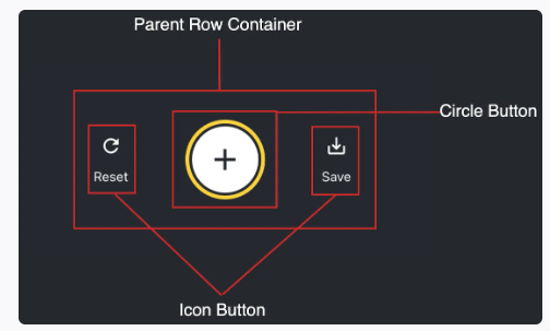
在components目录下,创建一个新的CircleButton.tsx文件,并添加以下代码:
1 2 3 4 5 6 7 8 9 10 11 12 13 14 15 16 17 18 19 20 21 22 23 24 25 26 27 28 29 30 31 32 33 34 35 36 import { Pressable , StyleSheet , View } from 'react-native' ;import MaterialIcons from '@expo/vector-icons/MaterialIcons' ;type Props = { onPress : () => void ; }; export default function CircleButton ({ onPress }: Props ) { return ( <View style ={styles.circleButtonContainer} > <Pressable style ={styles.circleButton} onPress ={onPress} > <MaterialIcons name ="add" size ={38} color ="#25292e" /> </Pressable > </View > ); } const styles = StyleSheet .create ({ circleButtonContainer : { width : 84 , height : 84 , marginHorizontal : 60 , borderWidth : 4 , borderColor : '#ffd33d' , borderRadius : 42 , padding : 3 , }, circleButton : { flex : 1 , justifyContent : 'center' , alignItems : 'center' , borderRadius : 42 , backgroundColor : '#fff' , }, });
在components目录下新建一个IconButton.tsx文件,并添加以下代码:
1 2 3 4 5 6 7 8 9 10 11 12 13 14 15 16 17 18 19 20 21 22 23 24 25 26 27 28 29 import { Pressable , StyleSheet , Text } from 'react-native' ;import MaterialIcons from '@expo/vector-icons/MaterialIcons' ;type Props = { icon : keyof typeof MaterialIcons .glyphMap ; label : string ; onPress ?: () => void ; }; export default function IconButton ({ icon, label, onPress }: Props ) { return ( <Pressable style ={styles.iconButton} onPress ={onPress} > <MaterialIcons name ={icon} size ={24} color ="#fff" /> <Text style ={styles.iconButtonLabel} > {label}</Text > </Pressable > ); } const styles = StyleSheet .create ({ iconButton : { justifyContent : 'center' , alignItems : 'center' , }, iconButtonLabel : { color : '#fff' , marginTop : 12 , }, });
在app/(tabs)/index.tsx中,进行更新
1 2 3 4 5 6 7 8 9 10 11 12 13 14 15 16 17 18 19 20 21 22 23 24 25 26 27 28 29 30 31 32 33 34 35 36 37 38 39 40 41 42 43 44 45 46 47 48 49 50 51 52 53 54 55 56 57 58 59 60 61 62 63 64 65 66 67 68 69 70 71 72 73 74 75 76 77 78 79 80 81 82 83 84 85 86 87 88 89 90 91 92 93 94 95 96 97 98 99 100 101 102 103 104 105 106 107 108 109 110 111 112 113 114 import Button from '@/components/Button' ;import ImageViewer from '@/components/ImageViewer' ;import { StyleSheet , View } from 'react-native' ;import * as ImagePicker from 'expo-image-picker' ;import { useState } from 'react' ;import IconButton from '@/components/IconButton' ;import CircleButton from '@/components/CircleButton' ;const PlaceholderImage = require ('@/assets/images/background-image.png' );export default function Index ( const [selectedImage, setSelectedImage] = useState<string | undefined >( undefined , ); const [showAppOptions, setShowAppOptions] = useState<boolean >(false ); const pickImageAsync = async ( let result = await ImagePicker .launchImageLibraryAsync ({ mediaTypes : ['images' ], allowsEditing : true , quality : 1 , }); if (!result.canceled ) { console .log (result); setSelectedImage (result.assets [0 ].uri ); setShowAppOptions (true ); } else { alert ('You did not select any image' ); } }; const onReset = ( setShowAppOptions (false ); }; const onAddSticker = ( }; const onSaveImageAsync = async ( }; return ( <View style ={styles.container} > <View style ={styles.imageContainer} > <ImageViewer imgSource ={PlaceholderImage} selectedImage ={selectedImage} /> </View > {showAppOptions ? ( <View style ={styles.optionContainer} > <View style ={styles.optionRow} > <IconButton icon ="refresh" label ="Reset" onPress ={onReset} /> <CircleButton onPress ={onAddSticker} /> <IconButton icon ="save-alt" label ="save" onPress ={onSaveImageAsync} /> </View > </View > ) : ( <View style ={styles.footerContainer} > <Button label ="Choose a photo" theme ="primary" onPress ={pickImageAsync} /> <Button label ="Use this photo" onPress ={() => setShowAppOptions(true)} /> </View > )} </View > ); } const styles = StyleSheet .create ({ container : { flex : 1 , backgroundColor : '#25292e' , alignItems : 'center' , }, imageContainer : { flex : 1 , paddingTop : 28 , }, footerContainer : { flex : 1 / 3 , alignItems : 'center' , }, optionContainer : { position : 'absolute' , bottom : 80 , }, optionRow : { alignItems : 'center' , flexDirection : 'row' , }, });
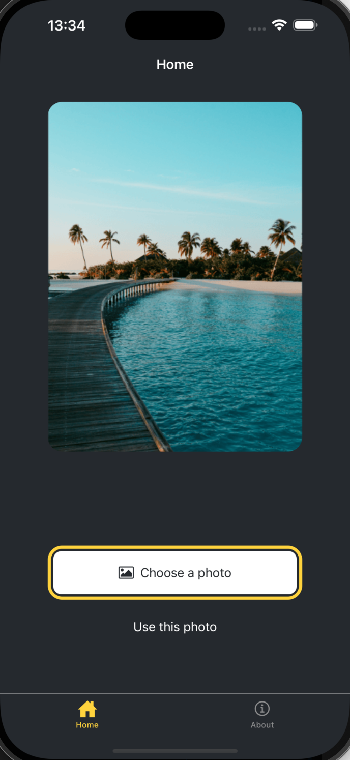
我们可以看到,当我们选择图片后,底部的按钮就会消失,并且会出现一个模态框,模态框中包含了三个按钮,分别是Reset、Add Sticker和Save。
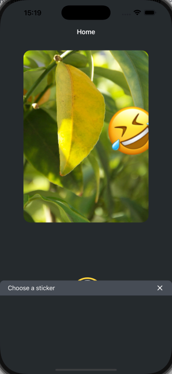
创建emoji选择器 在components目录下,新建一个EmojiPicker.tsx文件。该组件接受三个props:
isVisible:一个布尔值,用于控制模态框的显示和隐藏。onClose:关闭模态框的函数children:插槽,u用来显示表情符号列表
1 2 3 4 5 6 7 8 9 10 11 12 13 14 15 16 17 18 19 20 21 22 23 24 25 26 27 28 29 30 31 32 33 34 35 36 37 38 39 40 41 42 43 44 45 46 47 48 49 50 51 52 53 54 import MaterialIcons from '@expo/vector-icons/MaterialIcons' ;import { PropsWithChildren } from 'react' ;import { Modal , Pressable , StyleSheet , Text , View } from 'react-native' ;type Props = PropsWithChildren <{ isVisible : boolean ; onClose : () => void ; }>; export default function EmojiPicker ({ isVisible, onClose, children }: Props ) { return ( <View > <Modal animationType ="slide" transparent ={true} visible ={isVisible} > <View style ={styles.modalContent} > <View style ={styles.titleContainer} > <Text style ={styles.title} > Choose a sticker</Text > <Pressable onPress ={onClose} > <MaterialIcons name ="close" color ="#fff" size ={22} /> </Pressable > </View > { children } </View > </Modal > </View > ); } const styles = StyleSheet .create ({ modalContent : { height : '25%' , width : '100%' , backgroundColor : '#25292e' , borderTopRightRadius : 18 , borderTopLeftRadius : 18 , position : 'absolute' , bottom : 0 , }, titleContainer : { height : '16%' , backgroundColor : '#464c55' , borderTopRightRadius : 10 , borderTopLeftRadius : 10 , paddingHorizontal : 20 , flexDirection : 'row' , alignItems : 'center' , justifyContent : 'space-between' , }, title : { color : '#fff' , fontSize : 16 , }, });
修改app/(tabs)/index.tsx文件,在onAddSticker函数中,控制模态框的显示和隐藏。
1 2 3 4 5 6 7 8 9 10 11 12 13 14 15 16 17 18 19 20 21 22 23 24 25 26 27 28 29 30 31 32 33 34 35 36 37 38 39 40 41 42 43 44 45 46 47 48 49 50 51 52 53 54 55 56 57 58 59 60 61 62 63 64 65 66 67 68 69 70 71 72 73 74 75 76 77 78 79 80 81 82 83 84 85 86 87 88 89 90 91 92 93 94 95 96 97 98 99 100 101 102 103 104 105 106 107 108 109 110 111 112 113 114 115 116 117 118 119 120 121 122 123 124 125 126 127 128 129 130 131 132 133 134 135 136 137 import Button from '@/components/Button' ;import ImageViewer from '@/components/ImageViewer' ;import { StyleSheet , View } from 'react-native' ;import * as ImagePicker from 'expo-image-picker' ;import { useState } from 'react' ;import IconButton from '@/components/IconButton' ;import CircleButton from '@/components/CircleButton' ;import EmojiPicker from '@/components/EmojiPicker' ;const PlaceholderImage = require ('@/assets/images/background-image.png' );export default function Index ( const [selectedImage, setSelectedImage] = useState<string | undefined >( undefined , ); const [showAppOptions, setShowAppOptions] = useState<boolean >(false ); const [isModalVisible, setIsModalVisible] = useState<boolean >(false ); const pickImageAsync = async ( let result = await ImagePicker .launchImageLibraryAsync ({ mediaTypes : ['images' ], allowsEditing : true , quality : 1 , }); if (!result.canceled ) { console .log (result); setSelectedImage (result.assets [0 ].uri ); setShowAppOptions (true ); } else { alert ('You did not select any image' ); } }; const onReset = ( setShowAppOptions (false ); }; const onAddSticker = ( setIsModalVisible (true ); }; const onModalClose = ( setIsModalVisible (false ); }; const onSaveImageAsync = async ( }; return ( <View style ={styles.container} > <View style ={styles.imageContainer} > <ImageViewer imgSource ={PlaceholderImage} selectedImage ={selectedImage} /> </View > {showAppOptions ? ( <View style ={styles.optionContainer} > <View style ={styles.optionRow} > <IconButton icon ="refresh" label ="Reset" onPress ={onReset} /> <CircleButton onPress ={onAddSticker} /> <IconButton icon ="save-alt" label ="save" onPress ={onSaveImageAsync} /> </View > </View > ) : ( <View style ={styles.footerContainer} > <Button label ="Choose a photo" theme ="primary" onPress ={pickImageAsync} /> <Button label ="Use this photo" onPress ={() => setShowAppOptions(true)} /> </View > )} <EmojiPicker isVisible ={isModalVisible} onClose ={onModalClose} > </EmojiPicker > </View > ); } const styles = StyleSheet .create ({ container : { flex : 1 , backgroundColor : '#25292e' , alignItems : 'center' , }, imageContainer : { flex : 1 , paddingTop : 28 , }, footerContainer : { flex : 1 / 3 , alignItems : 'center' , }, optionContainer : { position : 'absolute' , bottom : 80 , }, optionRow : { alignItems : 'center' , flexDirection : 'row' , }, });
当我们点击加号来添加贴纸的时候,我们可以发现弹窗已经有了,只不过里面还没有内容而已。
创建表情符号列表 在components目录中创建一个EmojiList.tsx文件并添加以下代码:
1 2 3 4 5 6 7 8 9 10 11 12 13 14 15 16 17 18 19 20 21 22 23 24 25 26 27 28 29 30 31 32 33 34 35 36 37 38 39 40 41 42 43 44 45 46 47 48 49 50 51 52 53 54 55 import { Image } from "expo-image" ;import { useState } from "react" ;import { FlatList , ImageSourcePropType , Platform , Pressable , StyleSheet } from "react-native" ;type Props = { onSelect : (image : ImageSourcePropType void ; onCloseModal : () => void ; }; export default function EmojiList ({ onSelect, onCloseModal }: Props ) { const [emoji] = useState<ImageSourcePropType []>([ require ("@/assets/images/emoji1.png" ), require ("@/assets/images/emoji2.png" ), require ("@/assets/images/emoji3.png" ), require ("@/assets/images/emoji4.png" ), require ("@/assets/images/emoji5.png" ), require ("@/assets/images/emoji6.png" ), ]); return ( <FlatList horizontal showsHorizontalScrollIndicator ={Platform.OS === "web" } data ={emoji} contentContainerStyle ={styles.listContainer} renderItem ={({ item , index }) => ( <Pressable onPress ={() => { onSelect(item); onCloseModal(); }} > <Image source ={item} key ={index} style ={styles.image} /> </Pressable > )} /> ); } const styles = StyleSheet .create ({ listContainer : { borderTopRightRadius : 10 , borderTopLeftRadius : 10 , paddingHorizontal : 20 , flexDirection : "row" , alignItems : "center" , justifyContent : "space-between" , }, image : { width : 100 , height : 100 , marginRight : 20 , }, });
更新apps/(tabs)/index.tsx文件
1 2 3 4 5 6 7 8 9 10 11 12 13 14 15 16 17 18 19 20 21 22 23 24 25 26 27 28 29 30 31 32 33 34 35 36 37 38 39 40 41 42 43 44 45 46 47 48 49 50 51 52 53 54 55 56 57 58 59 60 61 62 63 64 65 66 67 68 69 70 71 72 73 74 75 76 77 78 79 80 81 82 83 84 85 86 87 88 89 90 91 92 93 94 95 96 97 98 99 100 101 102 103 104 105 106 107 108 109 110 111 112 113 114 115 import Button from "@/components/Button" ;import ImageViewer from "@/components/ImageViewer" ;import { ImageSourcePropType , StyleSheet , View } from "react-native" ;import * as ImagePicker from "expo-image-picker" ;import { useState } from "react" ;import IconButton from "@/components/IconButton" ;import CircleButton from "@/components/CircleButton" ;import EmojiPicker from "@/components/EmojiPicker" ;import EmojiList from "@/components/EmojiList" ;const PlaceholderImage = require ("@/assets/images/background-image.png" );export default function Index ( const [selectedImage, setSelectedImage] = useState<string | undefined >(undefined ); const [showAppOptions, setShowAppOptions] = useState<boolean >(false ); const [isModalVisible, setIsModalVisible] = useState<boolean >(false ); const [pickedEmoji, setPickedEmoji] = useState<ImageSourcePropType | undefined >(undefined ); const pickImageAsync = async ( let result = await ImagePicker .launchImageLibraryAsync ({ mediaTypes : ["images" ], allowsEditing : true , quality : 1 , }); if (!result.canceled ) { console .log (result); setSelectedImage (result.assets [0 ].uri ); setShowAppOptions (true ); } else { alert ("You did not select any image" ); } }; const onReset = ( setShowAppOptions (false ); }; const onAddSticker = ( setIsModalVisible (true ); }; const onModalClose = ( setIsModalVisible (false ); }; const onSaveImageAsync = async ( }; return ( <View style ={styles.container} > <View style ={styles.imageContainer} > <ImageViewer imgSource ={PlaceholderImage} selectedImage ={selectedImage} /> </View > {showAppOptions ? ( <View style ={styles.optionContainer} > <View style ={styles.optionRow} > <IconButton icon ="refresh" label ="Reset" onPress ={onReset} /> <CircleButton onPress ={onAddSticker} /> <IconButton icon ="save-alt" label ="save" onPress ={onSaveImageAsync} /> </View > </View > ) : ( <View style ={styles.footerContainer} > <Button label ="Choose a photo" theme ="primary" onPress ={pickImageAsync} /> <Button label ="Use this photo" onPress ={() => setShowAppOptions(true)} /> </View > )} <EmojiPicker isVisible ={isModalVisible} onClose ={onModalClose} > <EmojiList onSelect ={setPickedEmoji} onCloseModal ={onModalClose} /> </EmojiPicker > </View > ); } const styles = StyleSheet .create ({ container : { flex : 1 , backgroundColor : "#25292e" , alignItems : "center" , }, imageContainer : { flex : 1 , paddingTop : 28 , }, footerContainer : { flex : 1 / 3 , alignItems : "center" , }, optionContainer : { position : "absolute" , bottom : 80 , }, optionRow : { alignItems : "center" , flexDirection : "row" , }, });
显示选定的表情符号 在components目录中创建一个EmojiSticker.tsx文件并添加以下代码:
1 2 3 4 5 6 7 8 9 10 11 12 13 14 15 16 import { Image } from "expo-image" ;import { ImageSourcePropType , View } from "react-native" ;type Props = { imageSize : number ; stickerSource : ImageSourcePropType ; }; export default function EmojiSticker ({ imageSize, stickerSource }: Props ) { return ( <View style ={{ top: -350 }}> <Image source ={stickerSource} style ={{ width: imageSize , height: imageSize }} /> </View > ); }
在apps/(tabs)/index.tsx文件中,进行相应调整:
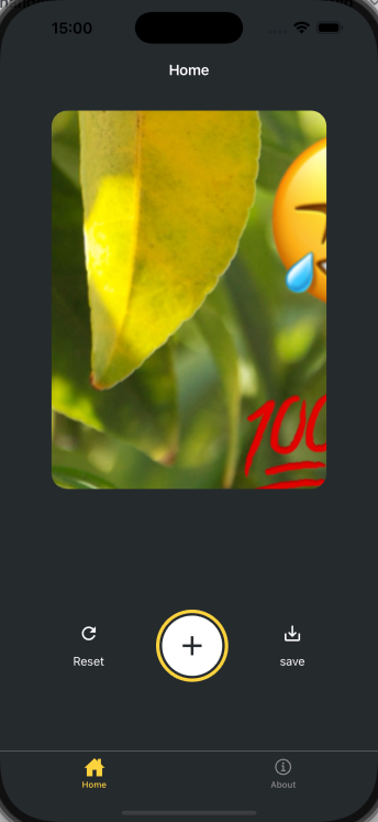
1 2 3 4 5 6 7 8 9 10 11 12 13 14 15 16 17 18 19 20 21 22 23 24 25 26 27 28 29 30 31 32 33 34 35 36 37 38 39 40 41 42 43 44 45 46 47 48 49 50 51 52 53 54 55 56 57 58 59 60 61 62 63 64 65 66 67 68 69 70 71 72 73 74 75 76 77 78 79 80 81 82 83 84 85 86 87 88 89 90 91 92 93 94 95 96 97 98 99 100 101 102 103 104 105 106 107 108 109 110 111 112 113 114 115 116 117 import Button from "@/components/Button" ;import ImageViewer from "@/components/ImageViewer" ;import { ImageSourcePropType , StyleSheet , View } from "react-native" ;import * as ImagePicker from "expo-image-picker" ;import { useState } from "react" ;import IconButton from "@/components/IconButton" ;import CircleButton from "@/components/CircleButton" ;import EmojiPicker from "@/components/EmojiPicker" ;import EmojiList from "@/components/EmojiList" ;import EmojiSticker from "@/components/EmojiSticker" ;const PlaceholderImage = require ("@/assets/images/background-image.png" );export default function Index ( const [selectedImage, setSelectedImage] = useState<string | undefined >(undefined ); const [showAppOptions, setShowAppOptions] = useState<boolean >(false ); const [isModalVisible, setIsModalVisible] = useState<boolean >(false ); const [pickedEmoji, setPickedEmoji] = useState<ImageSourcePropType | undefined >(undefined ); const pickImageAsync = async ( let result = await ImagePicker .launchImageLibraryAsync ({ mediaTypes : ["images" ], allowsEditing : true , quality : 1 , }); if (!result.canceled ) { console .log (result); setSelectedImage (result.assets [0 ].uri ); setShowAppOptions (true ); } else { alert ("You did not select any image" ); } }; const onReset = ( setShowAppOptions (false ); }; const onAddSticker = ( setIsModalVisible (true ); }; const onModalClose = ( setIsModalVisible (false ); }; const onSaveImageAsync = async ( }; return ( <View style ={styles.container} > <View style ={styles.imageContainer} > <ImageViewer imgSource ={PlaceholderImage} selectedImage ={selectedImage} /> {pickedEmoji && <EmojiSticker imageSize ={40} stickerSource ={pickedEmoji} /> } </View > {showAppOptions ? ( <View style ={styles.optionContainer} > <View style ={styles.optionRow} > <IconButton icon ="refresh" label ="Reset" onPress ={onReset} /> <CircleButton onPress ={onAddSticker} /> <IconButton icon ="save-alt" label ="save" onPress ={onSaveImageAsync} /> </View > </View > ) : ( <View style ={styles.footerContainer} > <Button label ="Choose a photo" theme ="primary" onPress ={pickImageAsync} /> <Button label ="Use this photo" onPress ={() => setShowAppOptions(true)} /> </View > )} <EmojiPicker isVisible ={isModalVisible} onClose ={onModalClose} > <EmojiList onSelect ={setPickedEmoji} onCloseModal ={onModalClose} /> </EmojiPicker > </View > ); } const styles = StyleSheet .create ({ container : { flex : 1 , backgroundColor : "#25292e" , alignItems : "center" , }, imageContainer : { flex : 1 , paddingTop : 28 , }, footerContainer : { flex : 1 / 3 , alignItems : "center" , }, optionContainer : { position : "absolute" , bottom : 80 , }, optionRow : { alignItems : "center" , flexDirection : "row" , }, });
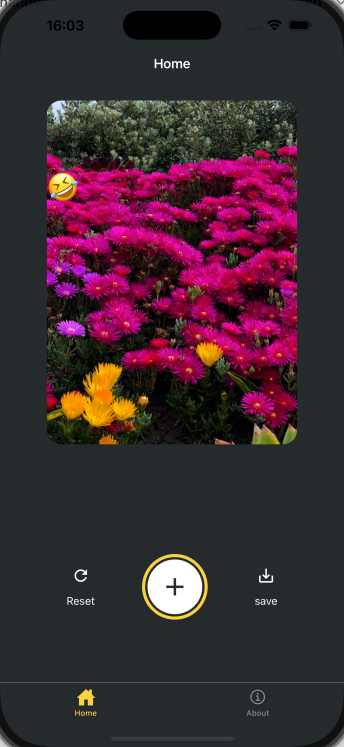
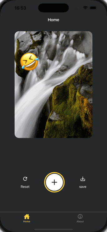
我们可以看到,当我们选择一个表情符号后,它将被添加到图片上。
添加手势 我们将实现两种手势:
双击可放大表情贴纸,再次双击缩小
按住贴纸平移可以在屏幕上移动表情贴纸
1 2 3 4 5 6 7 8 9 10 11 import { GestureHandlerRootView } from 'react-native-gesture-handler' ;export default function Index ( return ( <GestureHandlerRootView style ={styles.container} > {/* ...rest of the code remains */} </GestureHandlerRootView > ) }
修改components/EmojiSticker.tsx文件:
1 2 3 4 5 6 7 8 9 10 11 12 13 14 15 16 17 18 19 20 21 22 23 24 25 26 27 28 29 30 31 32 33 34 35 36 37 38 39 40 41 42 43 44 45 46 47 48 49 50 51 52 53 54 55 56 57 58 59 60 61 62 63 64 65 66 67 68 69 import { ImageSourcePropType , View } from "react-native" ;import { Gesture , GestureDetector } from "react-native-gesture-handler" ;import Animated , { useAnimatedStyle, useSharedValue, withSpring } from "react-native-reanimated" ;type Props = { imageSize : number ; stickerSource : ImageSourcePropType ; }; export default function EmojiSticker ({ imageSize, stickerSource }: Props ) { const scaleImage = useSharedValue (imageSize); const translateX = useSharedValue (0 ); const translateY = useSharedValue (0 ); const doubleTap = Gesture .Tap () .numberOfTaps (2 ) .onStart (() => { if (scaleImage.value !== imageSize * 2 ) { scaleImage.value = scaleImage.value * 2 ; } else { scaleImage.value = Math .round (scaleImage.value / 2 ); } }); const drag = Gesture .Pan ().onChange ((e ) => { translateX.value += e.changeX ; translateY.value += e.changeY ; }); const containerStyle = useAnimatedStyle (() => { return { transform : [ { translateX : translateX.value , }, { translateY : translateY.value , }, ], }; }); const imageStyle = useAnimatedStyle (() => { return { width : withSpring (scaleImage.value ), height : withSpring (scaleImage.value ), }; }); return ( <GestureDetector gesture ={drag} > <Animated.View style ={[containerStyle, { top: -350 }]}> <GestureDetector gesture ={doubleTap} > <Animated.Image source ={stickerSource} resizeMode ="contain" style ={[imageStyle, { width: imageSize , height: imageSize }]} /> </GestureDetector > </Animated.View > </GestureDetector > ); }
我们可以发现,当我们双击表情符号时,它会放大或缩小,当我们拖动时,它会平移。
保存图片 我们将使用react-native-view-shot和expo-media-library来保存图片
1 2 pnpm dlx expo install react-native-view-shot pnpm dlx expo install expo-media-library
修改app/(tabs)/index.tsx文件:
1 2 3 4 5 6 7 8 9 10 11 12 13 14 15 16 17 18 19 20 21 22 23 24 25 26 27 28 29 30 31 32 33 34 35 36 37 38 39 40 41 42 43 44 45 46 47 48 49 50 51 52 53 54 55 56 57 58 59 60 61 62 63 64 65 66 67 68 69 70 71 72 73 74 75 76 77 78 79 80 81 82 83 84 85 86 87 88 89 90 91 92 93 94 95 96 97 98 99 100 101 102 103 104 105 106 107 108 109 110 111 112 113 114 115 116 117 118 119 120 121 122 123 124 125 126 127 128 129 130 131 132 133 134 135 136 137 138 139 140 141 142 143 144 145 146 import Button from "@/components/Button" ;import ImageViewer from "@/components/ImageViewer" ;import { ImageSourcePropType , StyleSheet , View } from "react-native" ;import * as ImagePicker from "expo-image-picker" ;import { useEffect, useRef, useState } from "react" ;import IconButton from "@/components/IconButton" ;import CircleButton from "@/components/CircleButton" ;import EmojiPicker from "@/components/EmojiPicker" ;import EmojiList from "@/components/EmojiList" ;import EmojiSticker from "@/components/EmojiSticker" ;import { GestureHandlerRootView } from "react-native-gesture-handler" ;import { captureRef } from "react-native-view-shot" ;import * as MediaLibrary from "expo-media-library" ;const PlaceholderImage = require ("@/assets/images/background-image.png" );export default function Index ( const imageRef = useRef<View >(null ); const [permissionResponse, requestPermission] = MediaLibrary .usePermissions (); const [selectedImage, setSelectedImage] = useState<string | undefined >(undefined ); const [showAppOptions, setShowAppOptions] = useState<boolean >(false ); const [isModalVisible, setIsModalVisible] = useState<boolean >(false ); const [pickedEmoji, setPickedEmoji] = useState<ImageSourcePropType | undefined >(undefined ); const pickImageAsync = async ( let result = await ImagePicker .launchImageLibraryAsync ({ mediaTypes : ["images" ], allowsEditing : true , quality : 1 , }); if (!result.canceled ) { console .log (result); setSelectedImage (result.assets [0 ].uri ); setShowAppOptions (true ); } else { alert ("You did not select any image" ); } }; const onReset = ( setShowAppOptions (false ); }; const onAddSticker = ( setIsModalVisible (true ); }; const onModalClose = ( setIsModalVisible (false ); }; const onSaveImageAsync = async ( try { const localUrl = await captureRef (imageRef, { height : 440 , quality : 1 , }); await MediaLibrary .saveToLibraryAsync (localUrl); if (localUrl) { alert ("saved" ); } } catch (e) { console .log (e); } }; useEffect (() => { if (!permissionResponse?.granted ) { requestPermission (); } }); return ( <GestureHandlerRootView style ={styles.container} > <View style ={styles.imageContainer} > <View ref ={imageRef} collapsable ={false} > <ImageViewer imgSource ={PlaceholderImage} selectedImage ={selectedImage} /> {pickedEmoji && <EmojiSticker imageSize ={40} stickerSource ={pickedEmoji} /> } </View > </View > {showAppOptions ? ( <View style ={styles.optionContainer} > <View style ={styles.optionRow} > <IconButton icon ="refresh" label ="Reset" onPress ={onReset} /> <CircleButton onPress ={onAddSticker} /> <IconButton icon ="save-alt" label ="save" onPress ={onSaveImageAsync} /> </View > </View > ) : ( <View style ={styles.footerContainer} > <Button label ="Choose a photo" theme ="primary" onPress ={pickImageAsync} /> <Button label ="Use this photo" onPress ={() => setShowAppOptions(true)} /> </View > )} <EmojiPicker isVisible ={isModalVisible} onClose ={onModalClose} > <EmojiList onSelect ={setPickedEmoji} onCloseModal ={onModalClose} /> </EmojiPicker > </GestureHandlerRootView > ); } const styles = StyleSheet .create ({ container : { flex : 1 , backgroundColor : "#25292e" , alignItems : "center" , }, imageContainer : { flex : 1 , paddingTop : 28 , }, footerContainer : { flex : 1 / 3 , alignItems : "center" , }, optionContainer : { position : "absolute" , bottom : 80 , }, optionRow : { alignItems : "center" , flexDirection : "row" , }, });
处理平台差异 刚才我们使用react-native-view-shot来保存图片,但是web平台是无法使用这个的,所以我们要针对web平台进行额外的处理。
这里我们使用dom-to-image来在web中保存图片。
1 2 3 4 pnpm add dom-to-image # 安装类型声明文件 pnpm add -D @types/dom-to-image
修改app/(tabs)/index.tsx文件:
1 2 3 4 5 6 7 8 9 10 11 12 13 14 15 16 17 18 19 20 21 22 23 24 25 26 27 28 29 30 31 32 33 34 35 36 37 38 39 40 41 const onSaveImageAsync = async ( if (Platform .OS === 'web' ) { try { if (!imageRef.current ) { throw new Error ('Image ref is not available' ); } const dataUrl = await domtoimage.toJpeg (imageRef.current as unknown as Node , { quality : 0.95 , width : 320 , height : 440 , }); let link = document .createElement ('a' ); link.download = 'sticker-smash.jpeg' ; link.href = dataUrl; link.click (); } catch (e) { console .error ('Failed to save image:' , e); alert ('Failed to save image' ); } } else { try { const localUrl = await captureRef (imageRef, { height : 440 , quality : 1 , }); await MediaLibrary .saveToLibraryAsync (localUrl); if (localUrl) { alert ('saved' ); } } catch (e) { console .log (e); } } };
配置状态栏,启动画面和应用程序图标 配置状态栏 修改app/_layout.tsx文件。
1 2 3 4 5 6 7 8 9 10 11 12 13 import { Stack } from 'expo-router' ;import { StatusBar } from 'expo-status-bar' ;export default function RootLayout ( return ( <> <Stack > <Stack.Screen name ="(tabs)" options ={{ headerShown: false }} /> </Stack > <StatusBar style ="light" /> </> ); }
启动动画和应用程序图标在app.json文件中已经配置好,我们无需调整。
1 2 3 4 5 6 7 8 9 10 11 12 13 14 15 16 17 18 19 20 21 22 23 24 25 26 27 28 29 30 31 32 33 34 35 36 37 38 39 40 41 42 43 44 45 46 47 48 { "expo" : { "name" : "demo" , "slug" : "demo" , "version" : "1.0.0" , "orientation" : "portrait" , "icon" : "./assets/images/icon.png" , "scheme" : "demo" , "userInterfaceStyle" : "automatic" , "newArchEnabled" : true , "ios" : { "supportsTablet" : true } , "android" : { "adaptiveIcon" : { "backgroundColor" : "#E6F4FE" , "foregroundImage" : "./assets/images/android-icon-foreground.png" , "backgroundImage" : "./assets/images/android-icon-background.png" , "monochromeImage" : "./assets/images/android-icon-monochrome.png" } , "edgeToEdgeEnabled" : true , "predictiveBackGestureEnabled" : false } , "web" : { "output" : "static" , "favicon" : "./assets/images/favicon.png" } , "plugins" : [ "expo-router" , [ "expo-splash-screen" , { "image" : "./assets/images/splash-icon.png" , "imageWidth" : 200 , "resizeMode" : "contain" , "backgroundColor" : "#ffffff" , "dark" : { "backgroundColor" : "#000000" } } ] ] , "experiments" : { "typedRoutes" : true , "reactCompiler" : true } } }
打包构建 这里我们使用expo官方推荐的EAS(Expo Application Services)构建,从而实现更快的分发。
安装最新版的eas-cli
1 2 3 4 5 # 全局安装 pnpm add -g eas-cli@latest # 登录 eas login
没有账户的可以去expo官网注册一个。【】
1 2 3 4 5 # 测试是否登录成功 eas whoami # 配置项目 eas build:configure
配置完成后,我们发现在项目的根目录有了一个eas.json文件,这个文件是EAS构建的配置文件。
为了便于开发,我们在这里创建一个开发版本 的应用程序,开发版本包含expo-dev-client方便我们在客户端进行调试。
1
2
# 安装开发调试工具 pnpm dlx expo install expo-dev-client
这里我们出于简单起见,创建一个Android自由分发的版本,从而避免了应用商店的复杂配置过程。
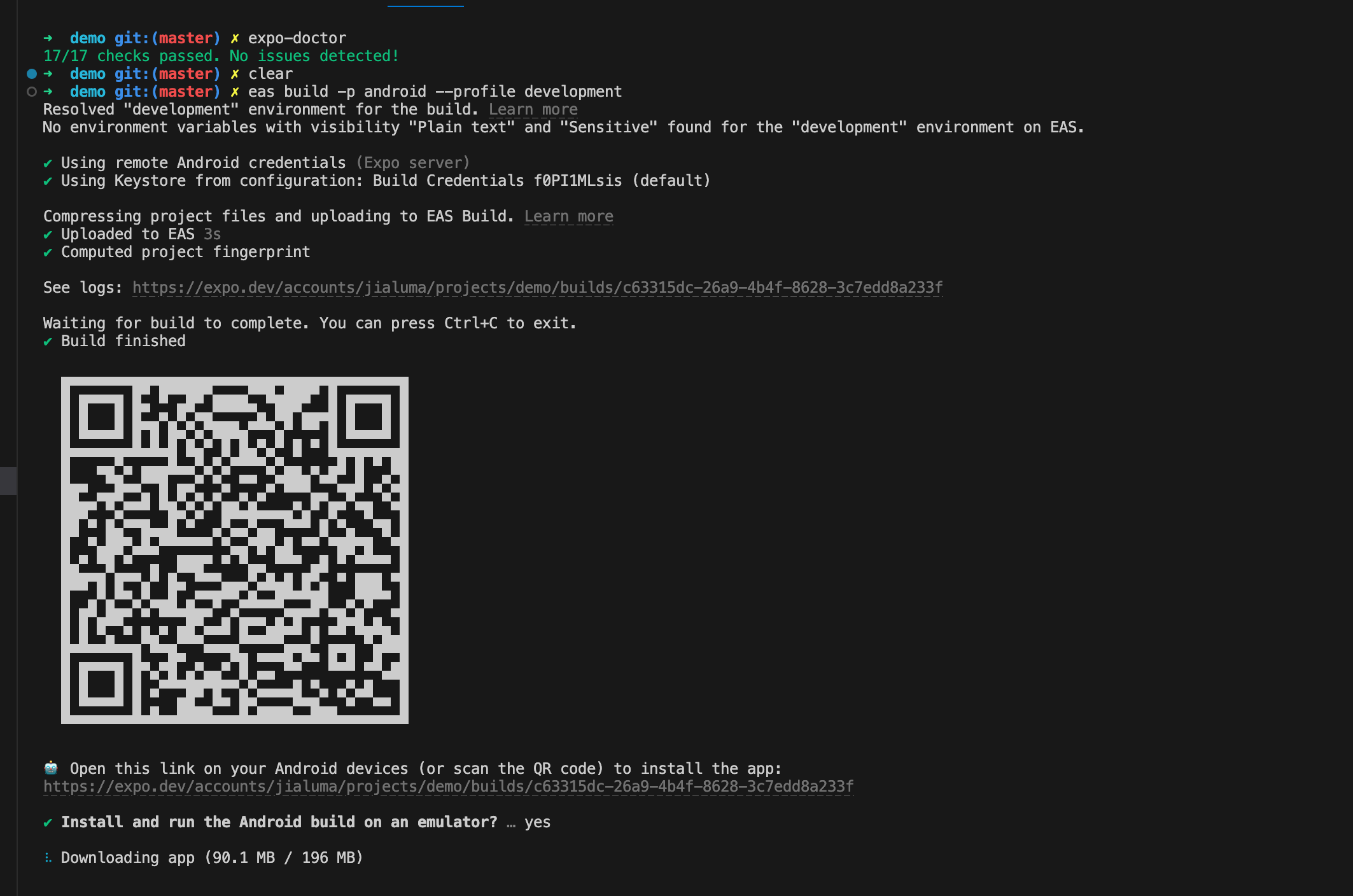
1
2
# 创建Android自由分发的版本 eas build --platform android --profile development
云构建完成后,终端会输出一个二维码,用Android手机扫码即可下载应用。
这里最好使用科学上网,否则下载有点慢。如果我们不想要开发版本,想要预览版本,直接构建预览版即可。
1
2
# 创建预览版 eas build --platform android --profile preview
总结 本文从RN的介绍出发,用一个简单的应用demo来演示如何使用expo进行RN开发,以及打包构建。
本专栏的后续文章会继续深入讲解RN的开发知识以及性能优化手段,欢迎订阅关注 👏🏻👏🏻👏🏻
好了,这篇文章就到这里啦,如果对您有所帮助,欢迎点赞,收藏,分享👍👍👍。您的认可是我更新的最大动力。由于笔者水平有限,难免有疏漏不足之处,欢迎各位大佬评论区指正。
往期推荐✨✨✨
我是前端拿破轮,关注我,和您分享前端知识,我们下期见!
 微信
微信 支付宝
支付宝